HUGO TECH
HUGO Tech is an autonomous and supervised delivery solution for last mile delivery and it increases service quality and drastically lowers costs.
In collaboration with students from UX22, IT-Högskolan I created a refreshed re-branding for HUGO. The process included combining logo’s designed by Fredrik and Joel and personally developing a complete branding package for HUGO.
Website
hugo.tech
In collaboration with
Fredrik Aidefors
Joel Engblom
Core and accent colors
Text and symbol color is Carbon, Light colors are Park and Robot. Accent colors for interactive elements and anywhere there is a splash of color jneeded.
Image usage
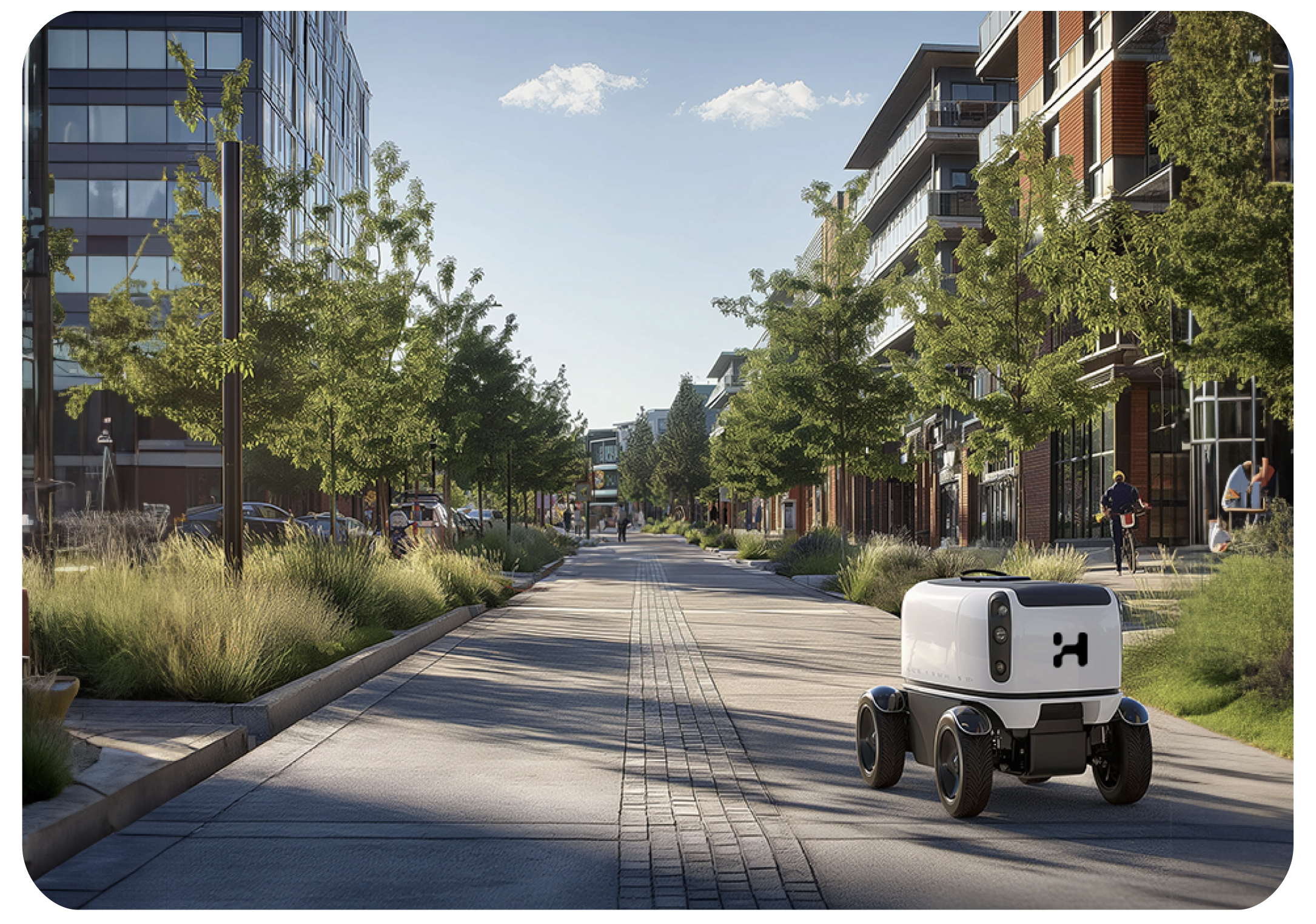
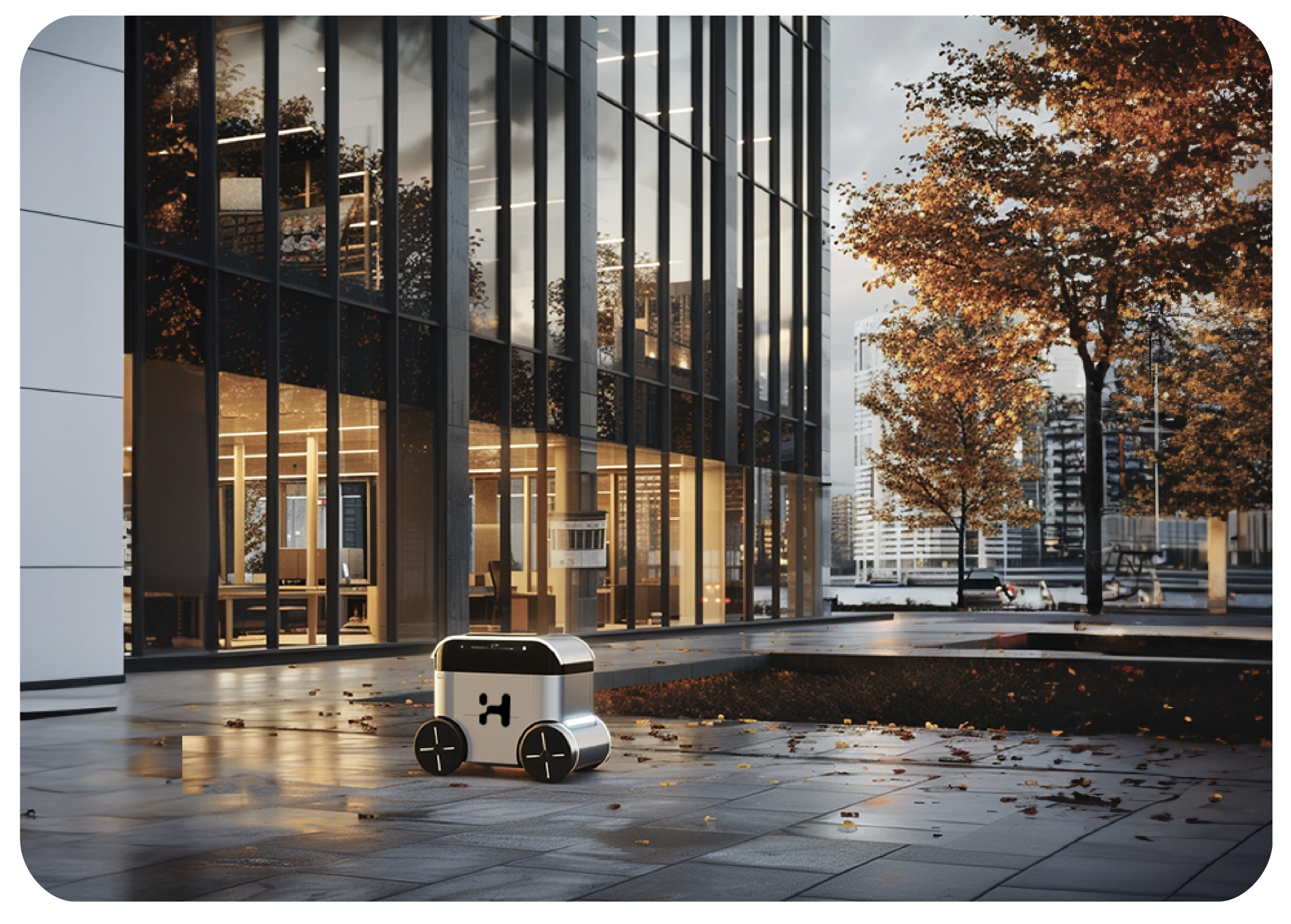
Mockups and photography should focus on lively city environments. Hugo robots are part of the cityscape.
Daylight, greenery and clean pavement is prefered. Human activity is prefered.

Branding applications
Big fonts, columned layout, accent coloured Call to Action usage and lots of space!


